Ottri is a lending platform that helps businesses offer financing to their customers. It makes the whole process easier, from applying for a loan to getting approved and funded.
Client view
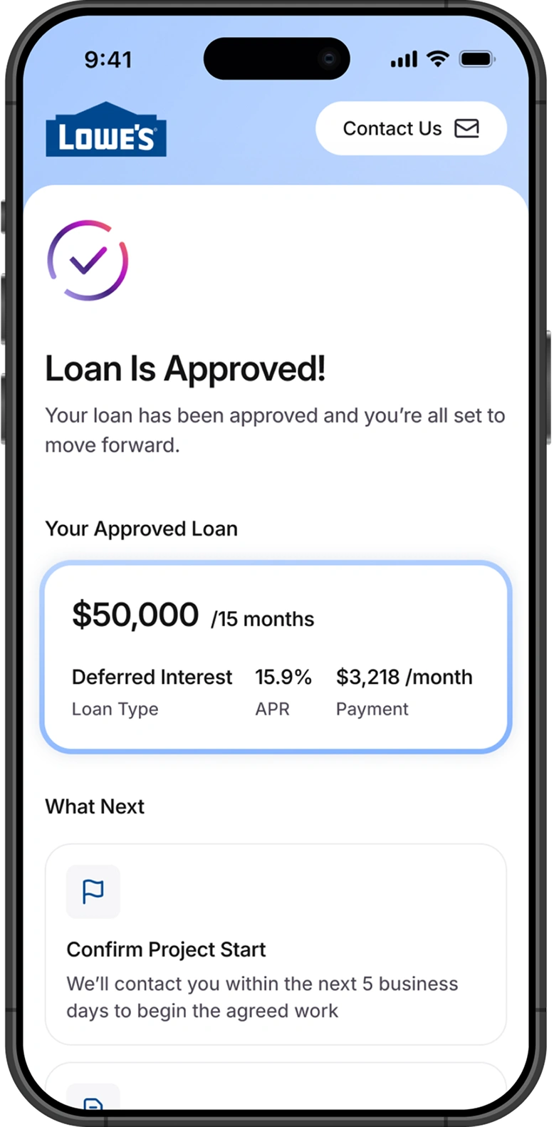
The Client View is a link businesses send to their customers. Customers use it to enter their information and apply for financing.
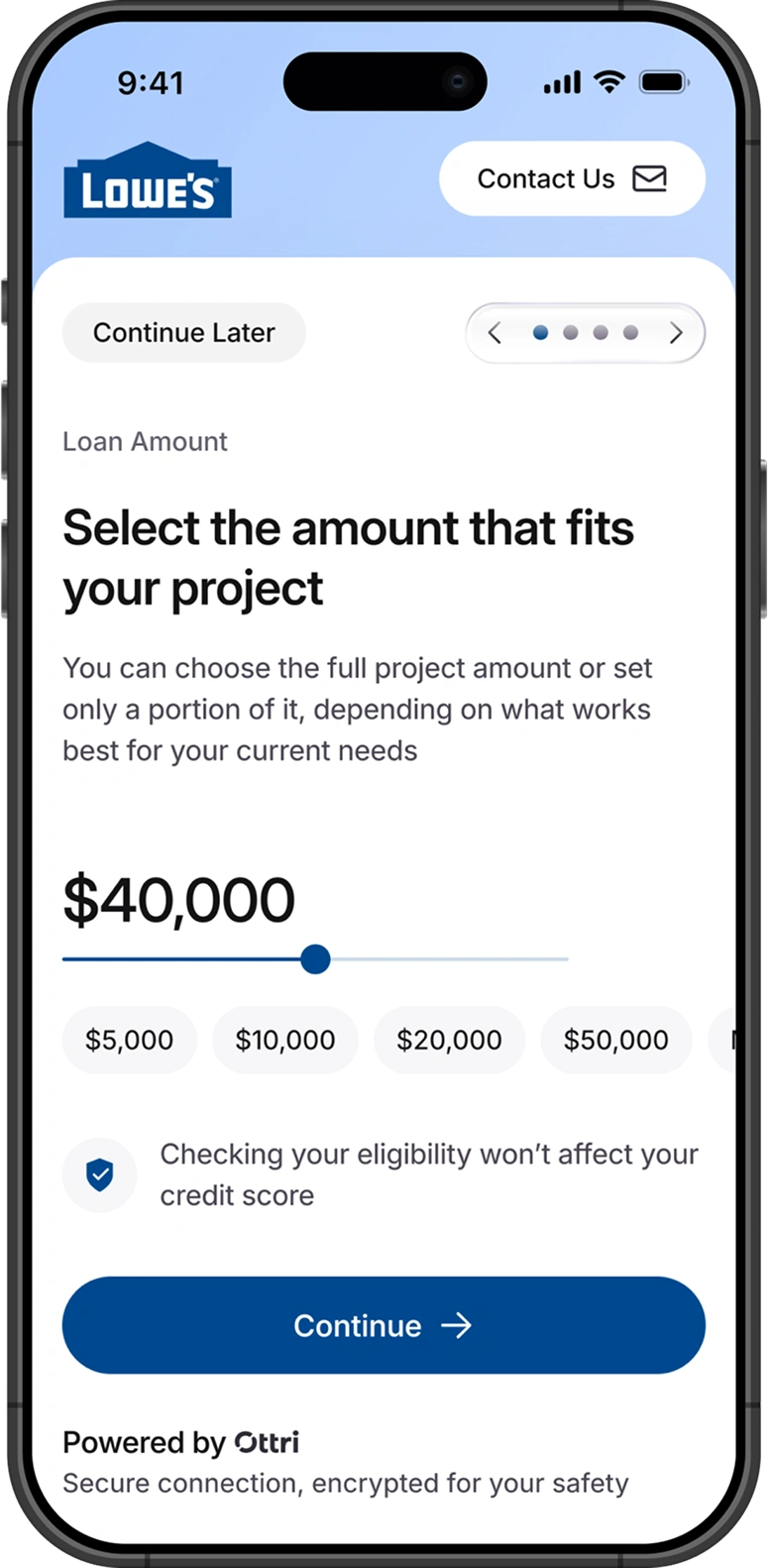
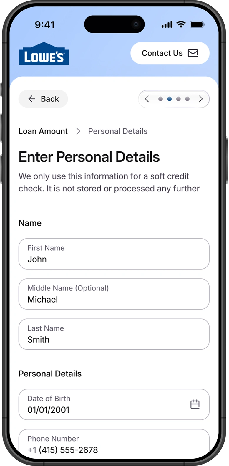
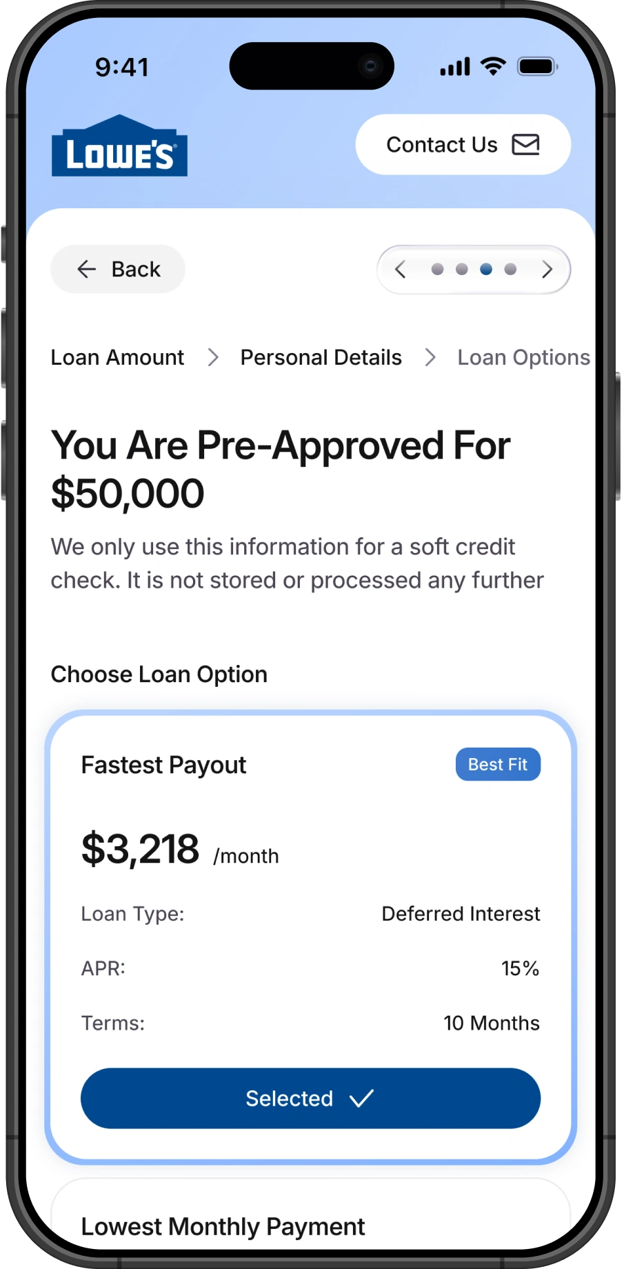
In the end, the customer sees a success screen confirming that their application has been submitted.
Custom colors
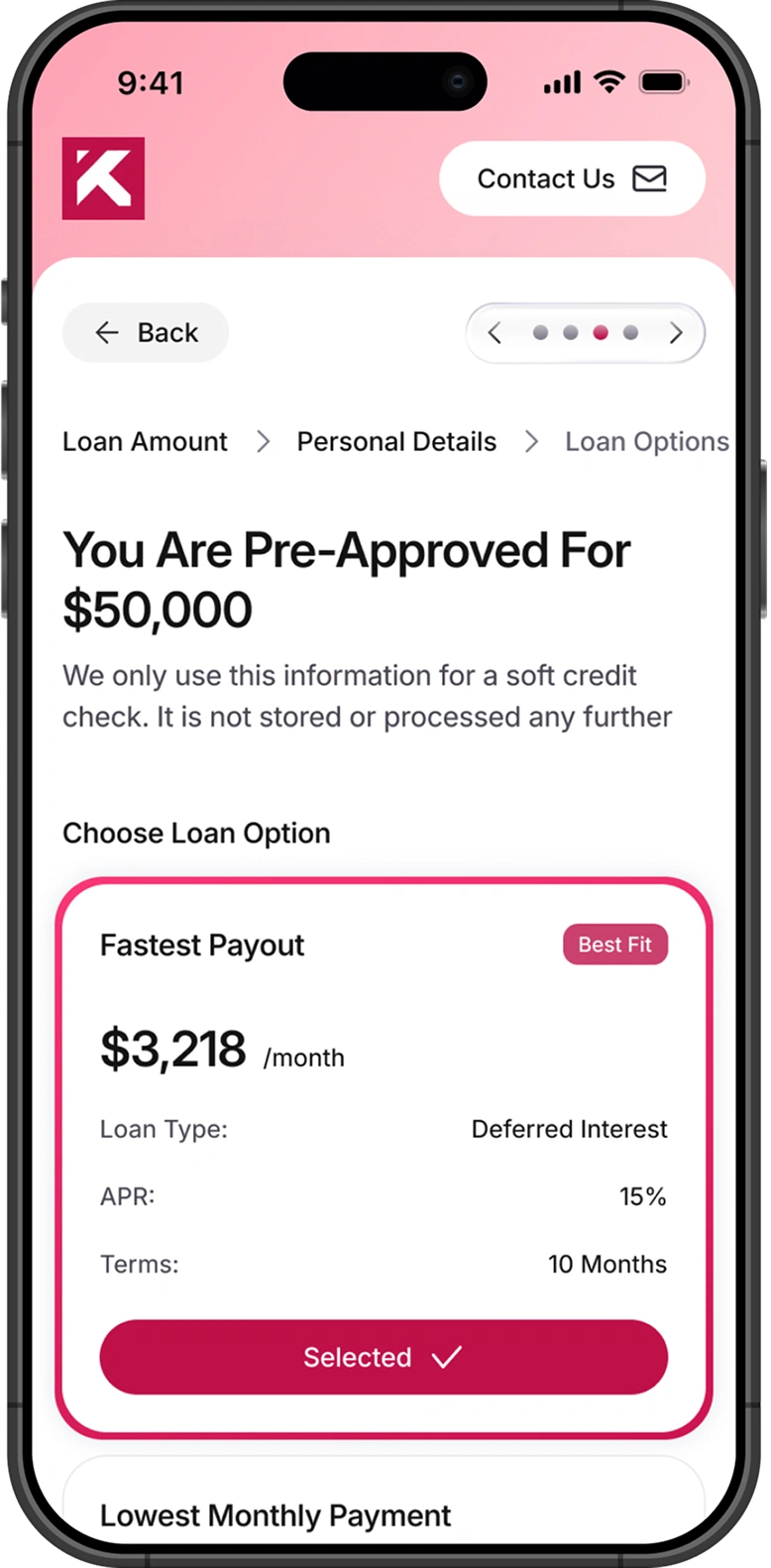
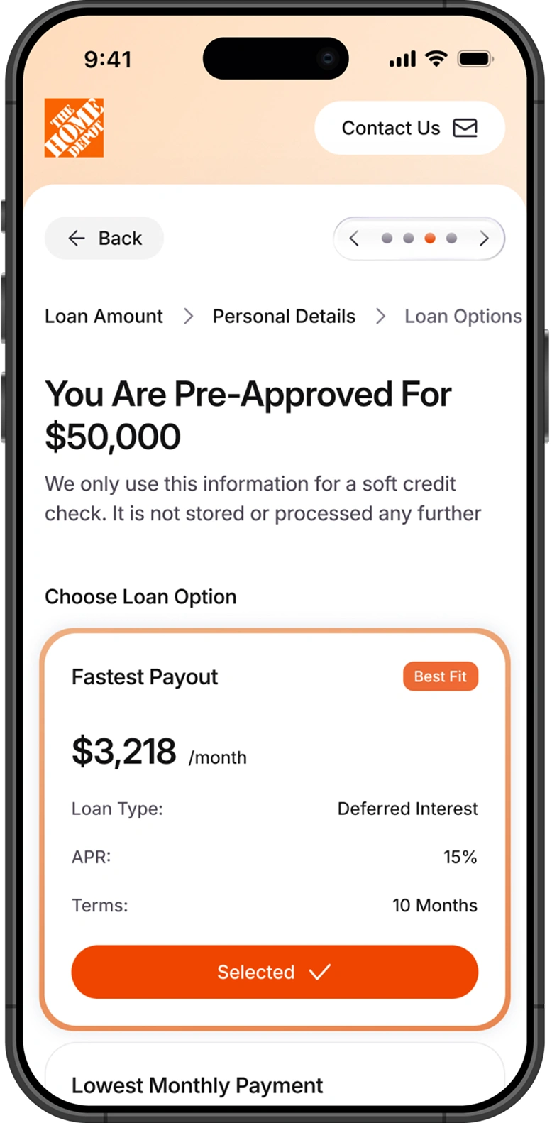
Businesses can customize the look of their client links, including colors. Along with preset options, I wanted to give them the ability to use their own primary color. The challenge was making sure the interface stayed readable with any color they chose.
To solve this, I used a token-based approach. When a user enters a primary color, the system automatically generates a palette based on it. Each UI element uses a specific token from this palette. For example, primary buttons use the 700 token to ensure they always stay readable.
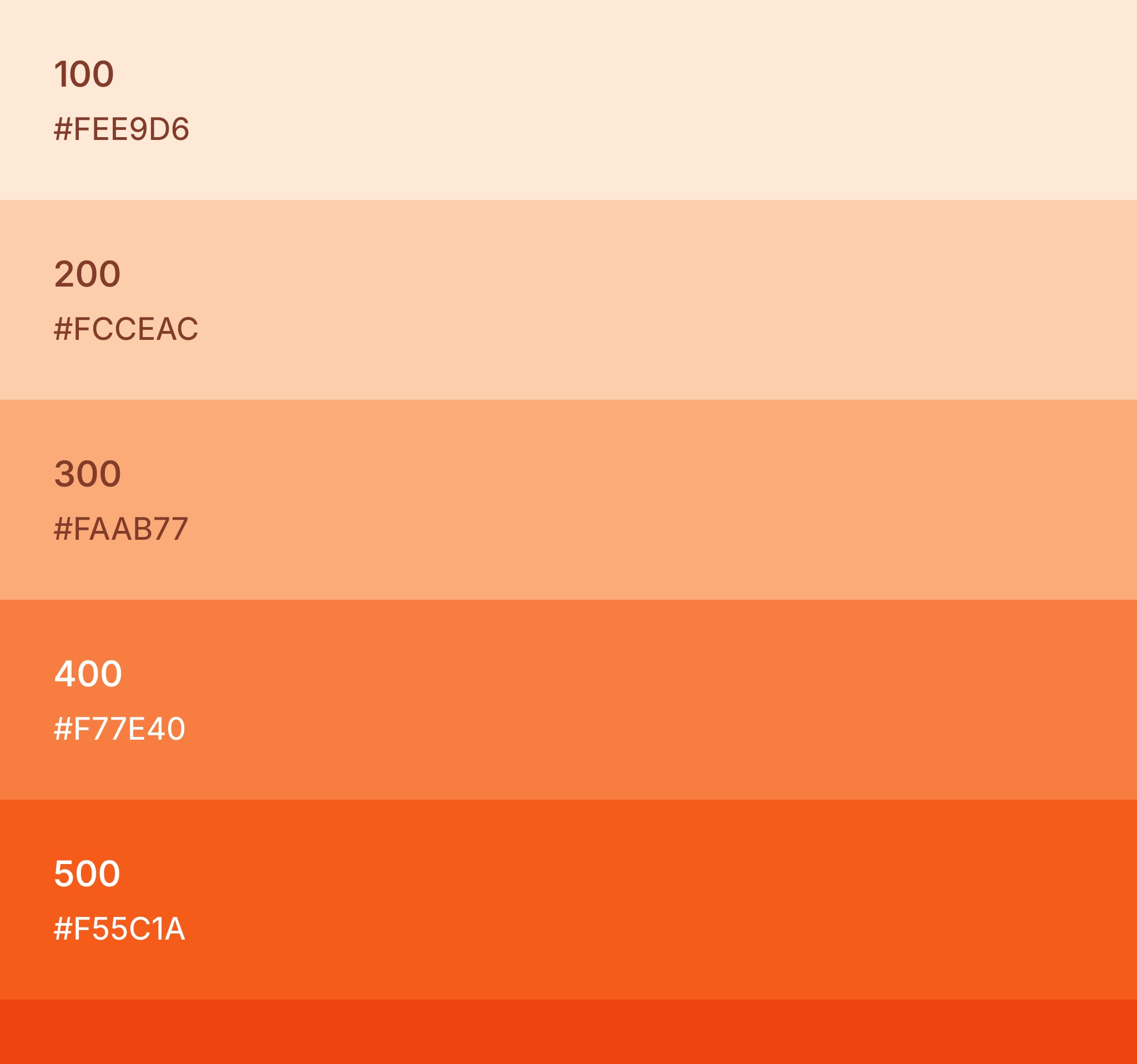
As a result, businesses gained more freedom to customize their client links with colors while keeping the process simple.
Settings
I also designed both personal and admin settings, covering everything from individual preferences to business information, team management, roles, services, and branding.
Business owners can easily manage their teams by inviting employees, assigning roles, and creating custom roles with different permissions.
Branding settings let businesses customize the client experience with their own logo and brand color, with previews for both desktop and mobile.
Profile settings let users manage personal information, update their avatar and phone number, and control security and notification preferences.