Menufier is a digital menu platform for cafés and coffee shops. Most QR code menus look outdated or feel too vibe coded. My goal was to give small business owners access to good design without having to hire a designer.
Vibe coding
During this project, I've been learning a lot about what coding with AI can actually do. I started with Cursor, moved to Codex, and eventually ended up using Claude Code.
Claude Code became my main tool for the project, going beyond coding and helping me with design, strategic planning, product decisions, and marketing.
Since I started by creating a design system and outlining my design principles to Claude, a lot of the design was created directly in code without ever touching Figma.
Onboarding
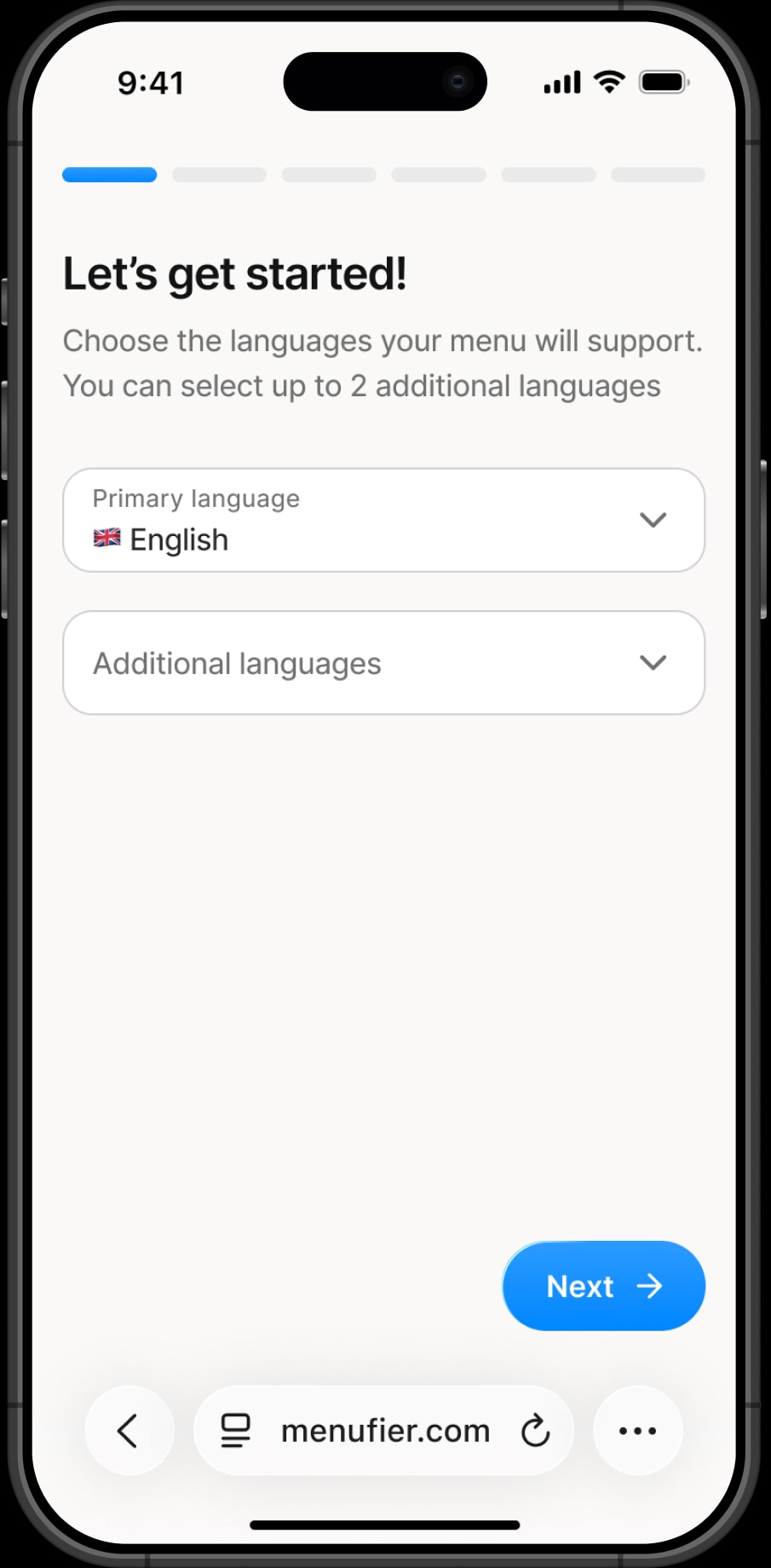
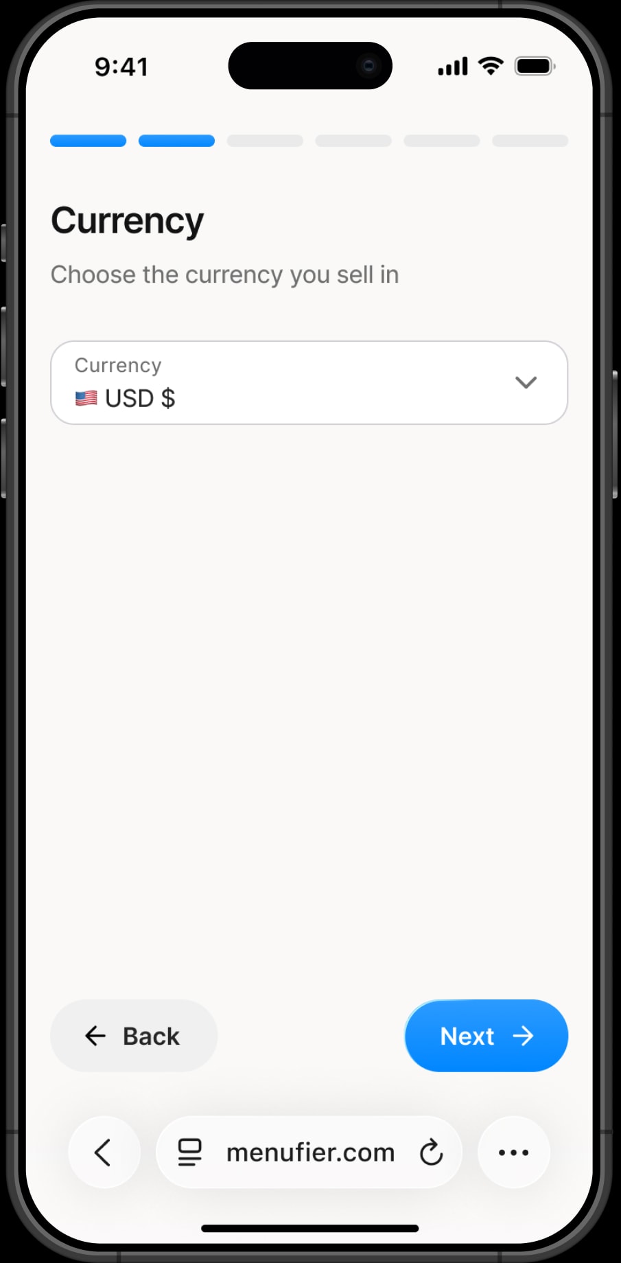
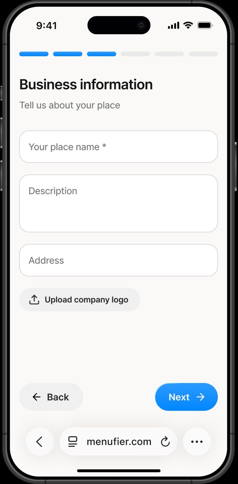
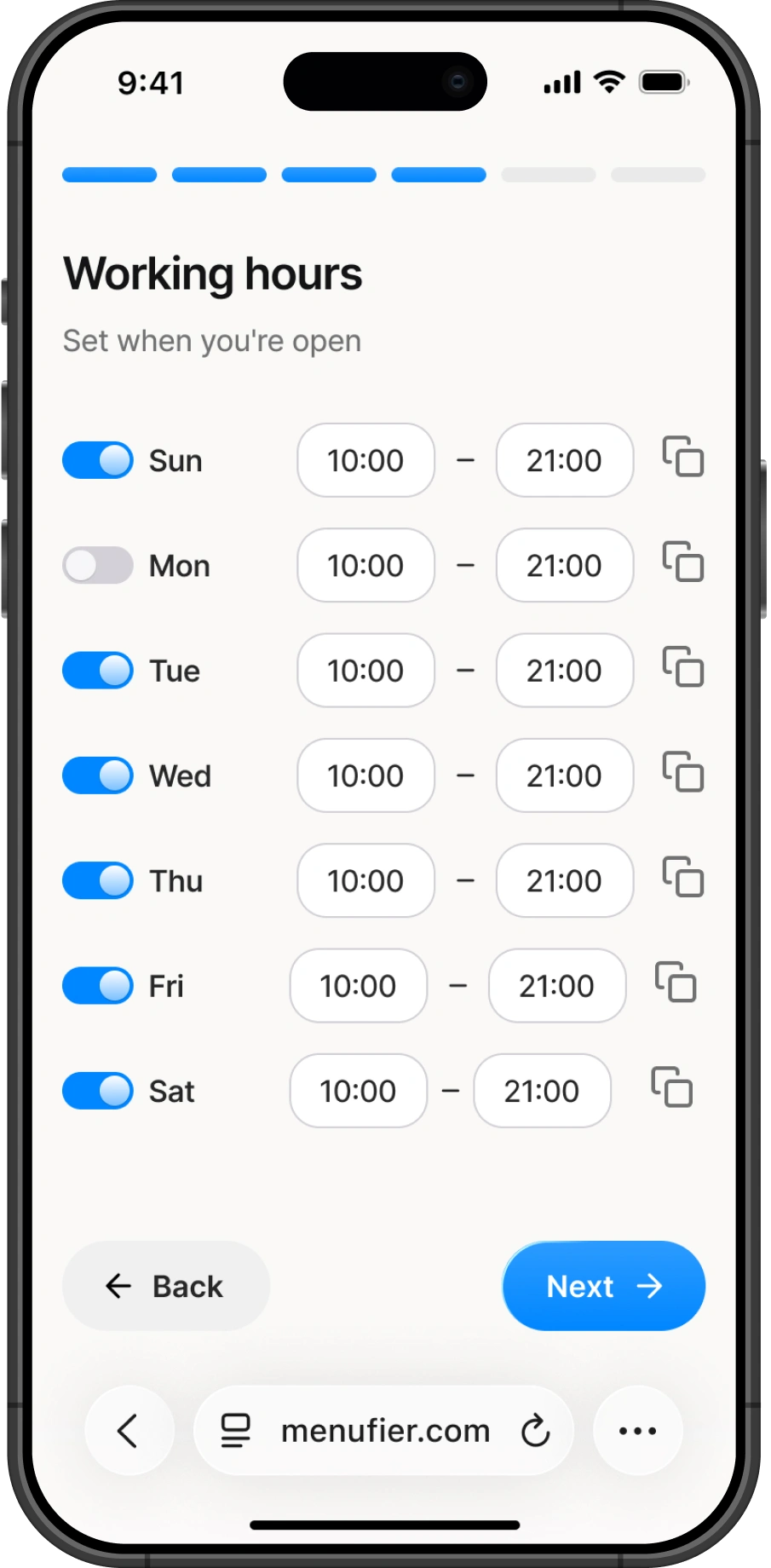
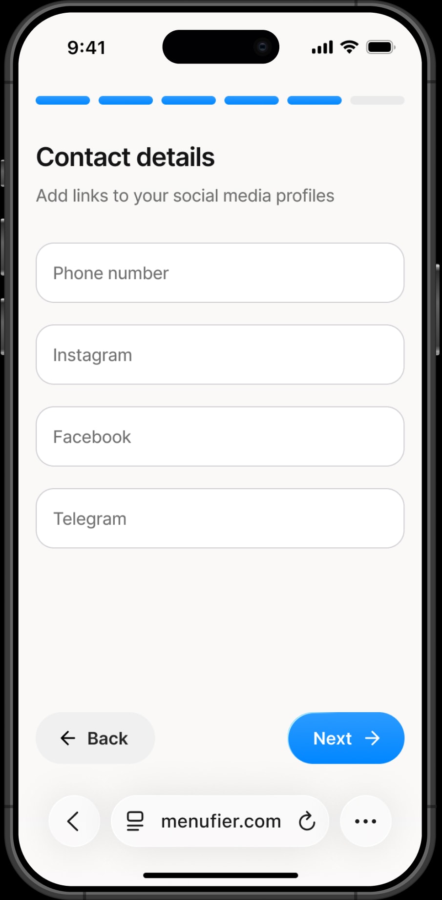
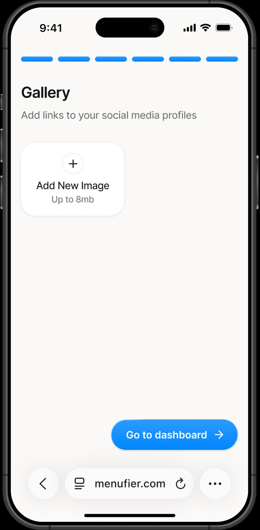
Onboarding consists of 6 steps and collects all the necessary information about the place. The goal was to reduce repetitive actions as much as possible. For example, when setting working hours, users can set the hours for one day and copy them to the rest of the week.
Dashboard
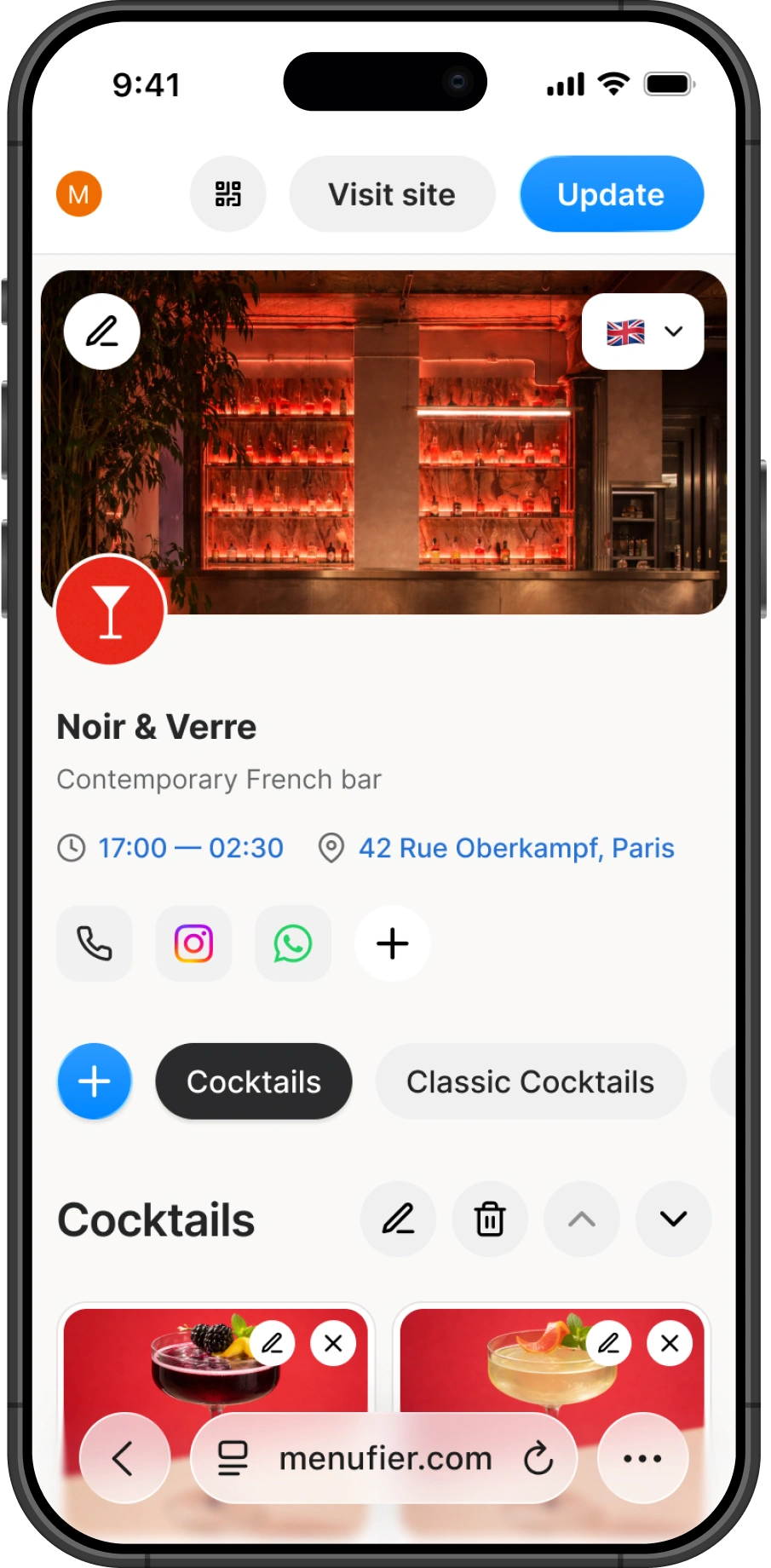
Unlike many menu builders, I decided not to split the experience across multiple sections and extra navigation. Instead, users land straight on the dashboard with their menu, and most of the work happens right there.
Performing actions like changing settings or adding a new dish happens in modals.
Public menu
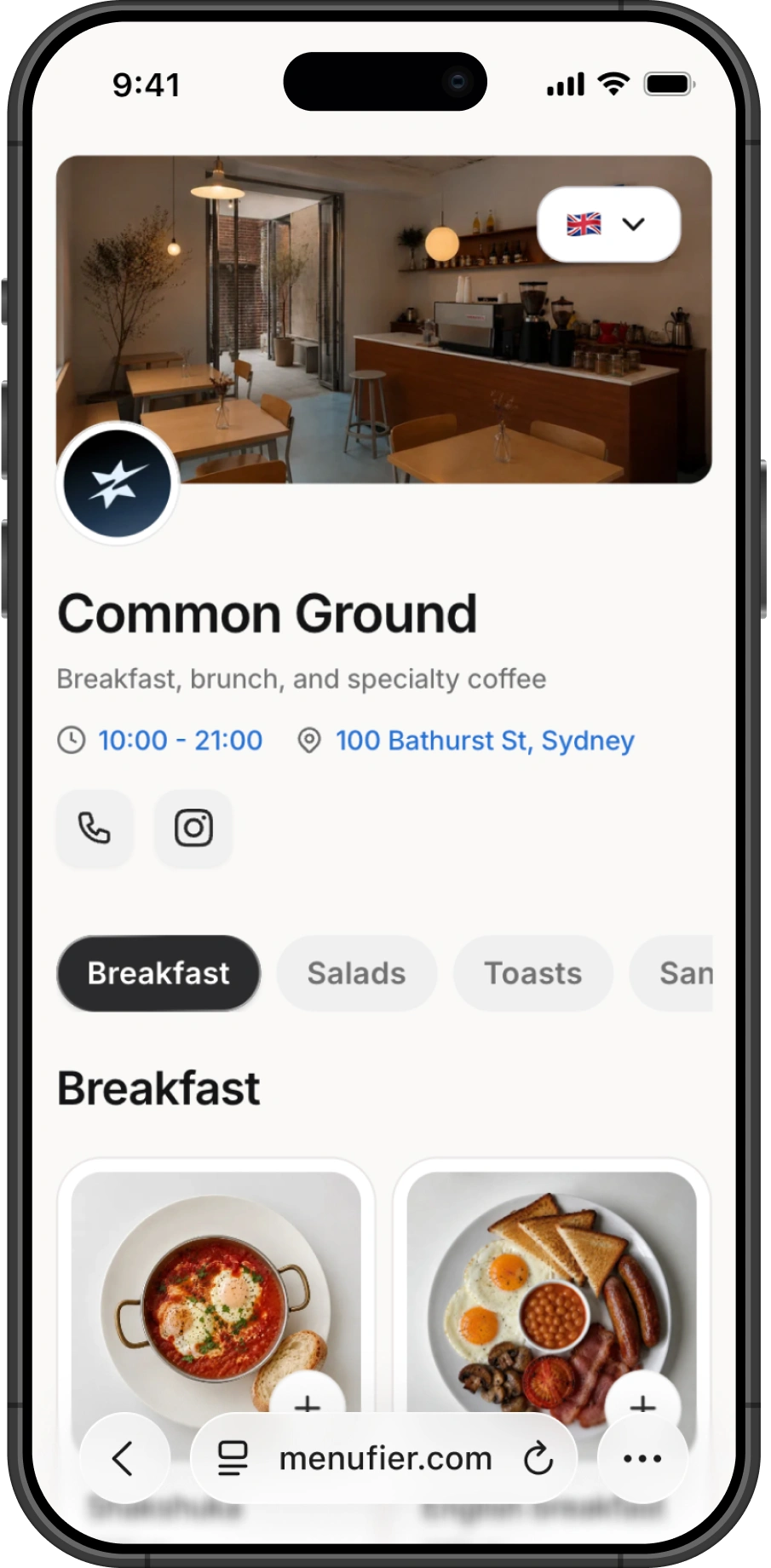
From the dashboard, café owners can publish their menu and instantly get a public link and QR code. Since this is the part guests actually interact with, I treated the public menu as the core experience of the product.
Place owners can enable online orders for their menu. Once enabled, guests can place an order directly from their phone, and the order is sent to the café's Telegram through a dedicated bot.
I designed two order flows: takeaway and dine-in. For dine-in orders, each table has a number that guests enter before placing the order, so the café knows where to deliver it.
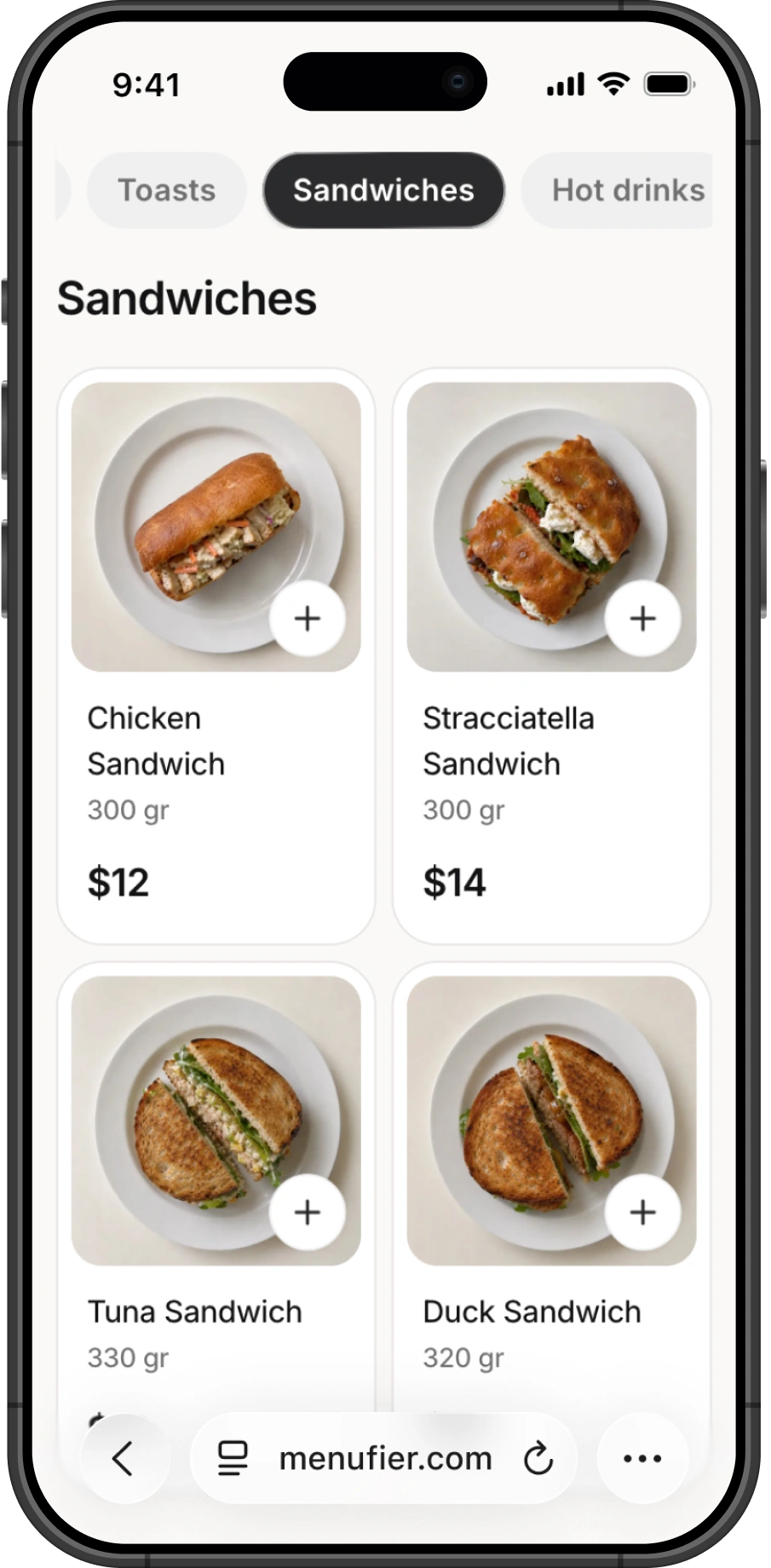
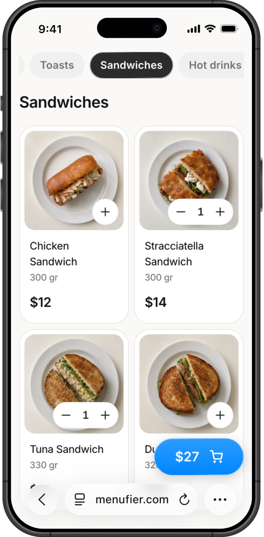
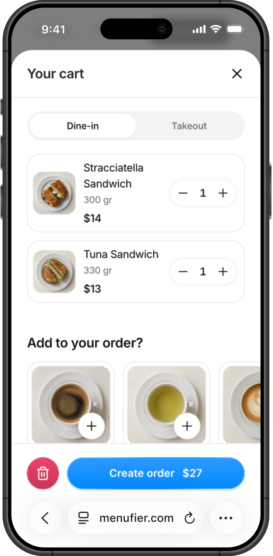
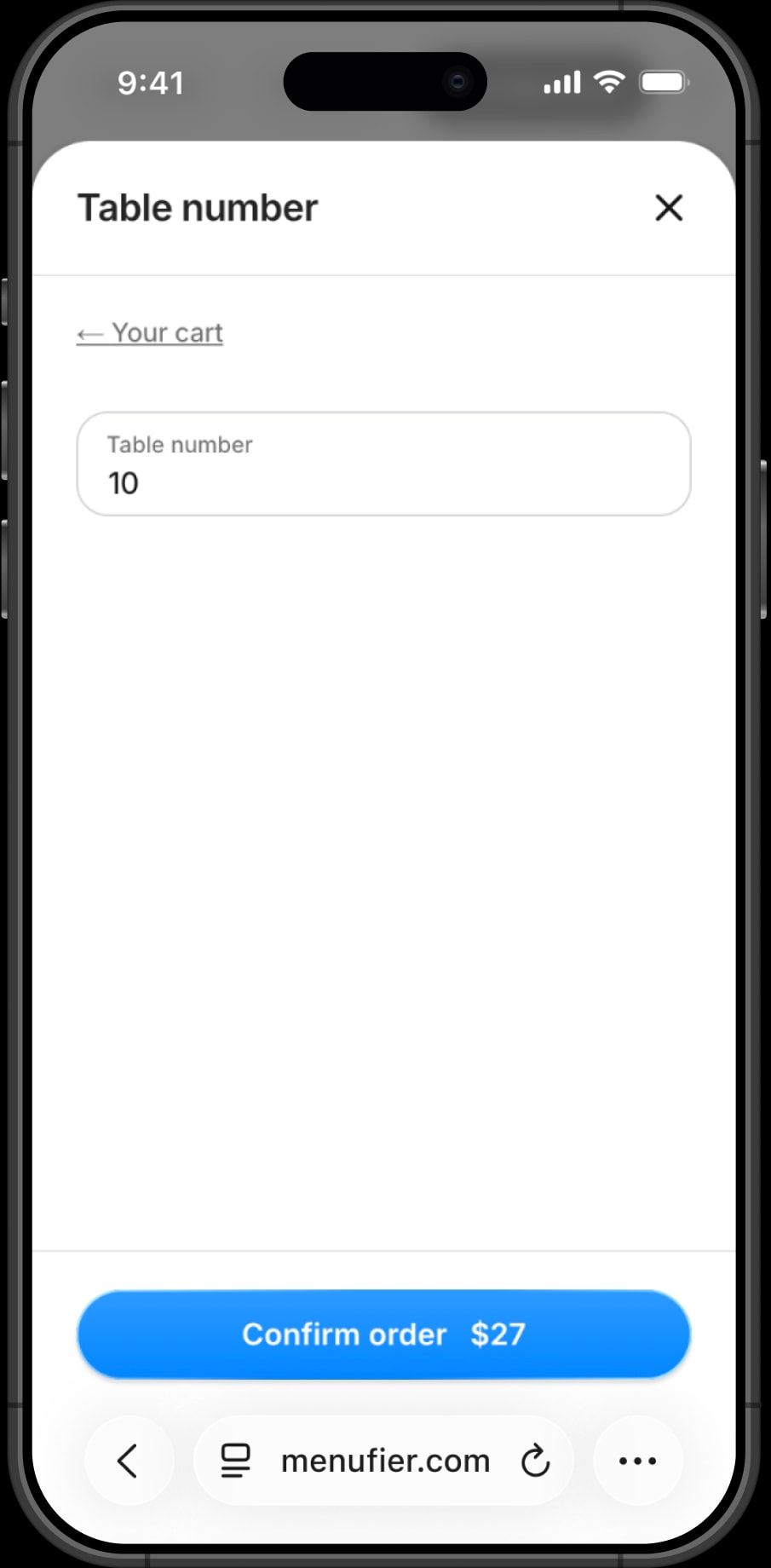
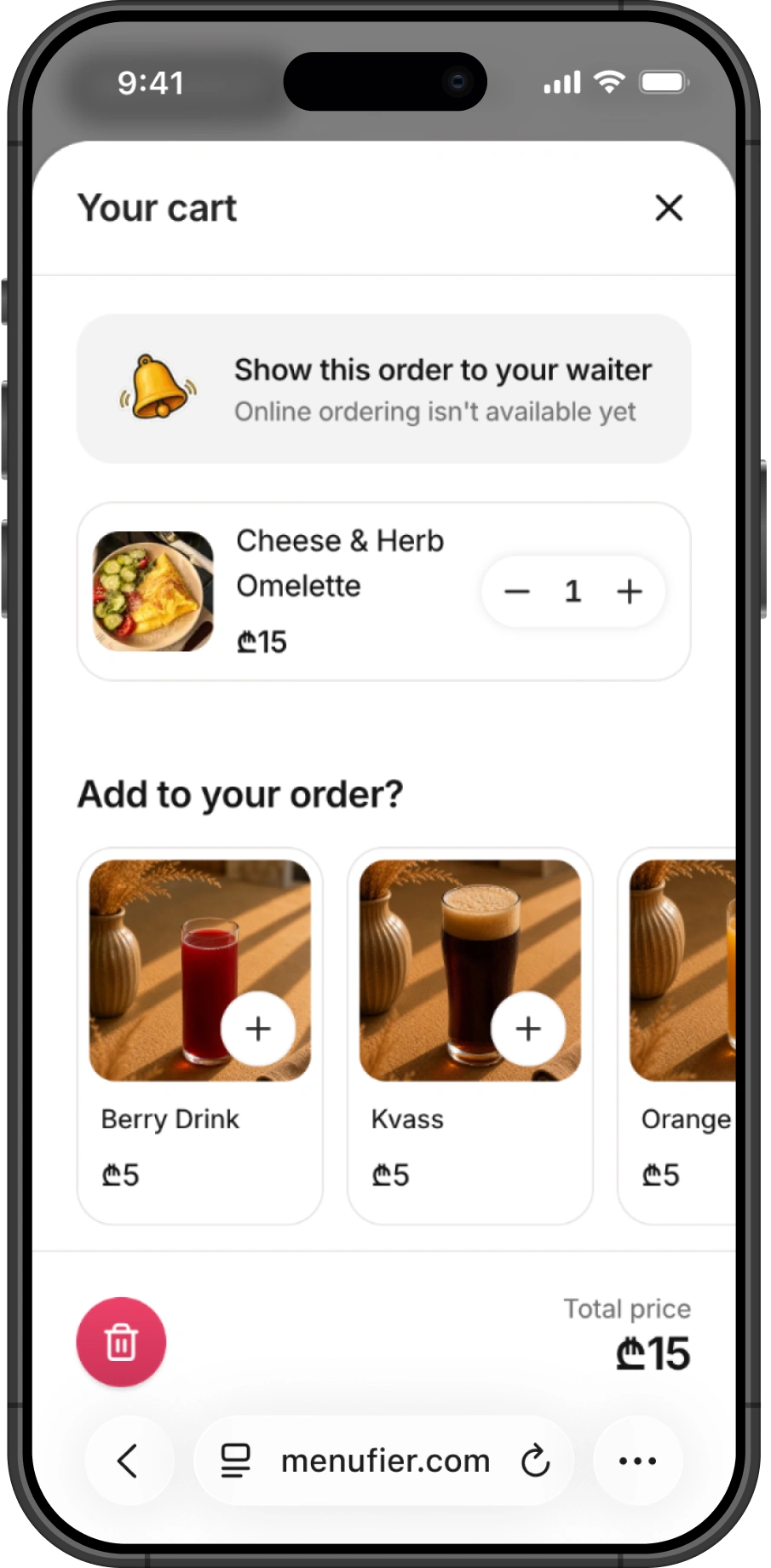
Even if the place owner hasn't enabled online orders, guests can still add dishes to the cart. This helps them keep track of what they want to order and see the total price without having to remember everything.
In this case, guests see a message explaining that online ordering isn't available and that they can simply show the order to the waiter.
Animations
I wanted to pay a bit more attention to the details, so place owners could feel the quality of the product from the very beginning. That's why I added micro-animations throughout the experience.
To create them, I used Emil Kowalski's design skills, which helped a lot throughout the process.
Here's one of them. Set the hours for a day, then copy them to whichever other days you pick — the same interaction place owners run during onboarding.