Predictor is a media platform built around prediction markets, where users can follow current events, explore markets, and predict their outcomes.
UX audit
The goal of the project was to conduct a UX audit and introduce targeted changes to improve usability. The existing UI and design system were kept largely intact, with only specific areas redesigned.
Home
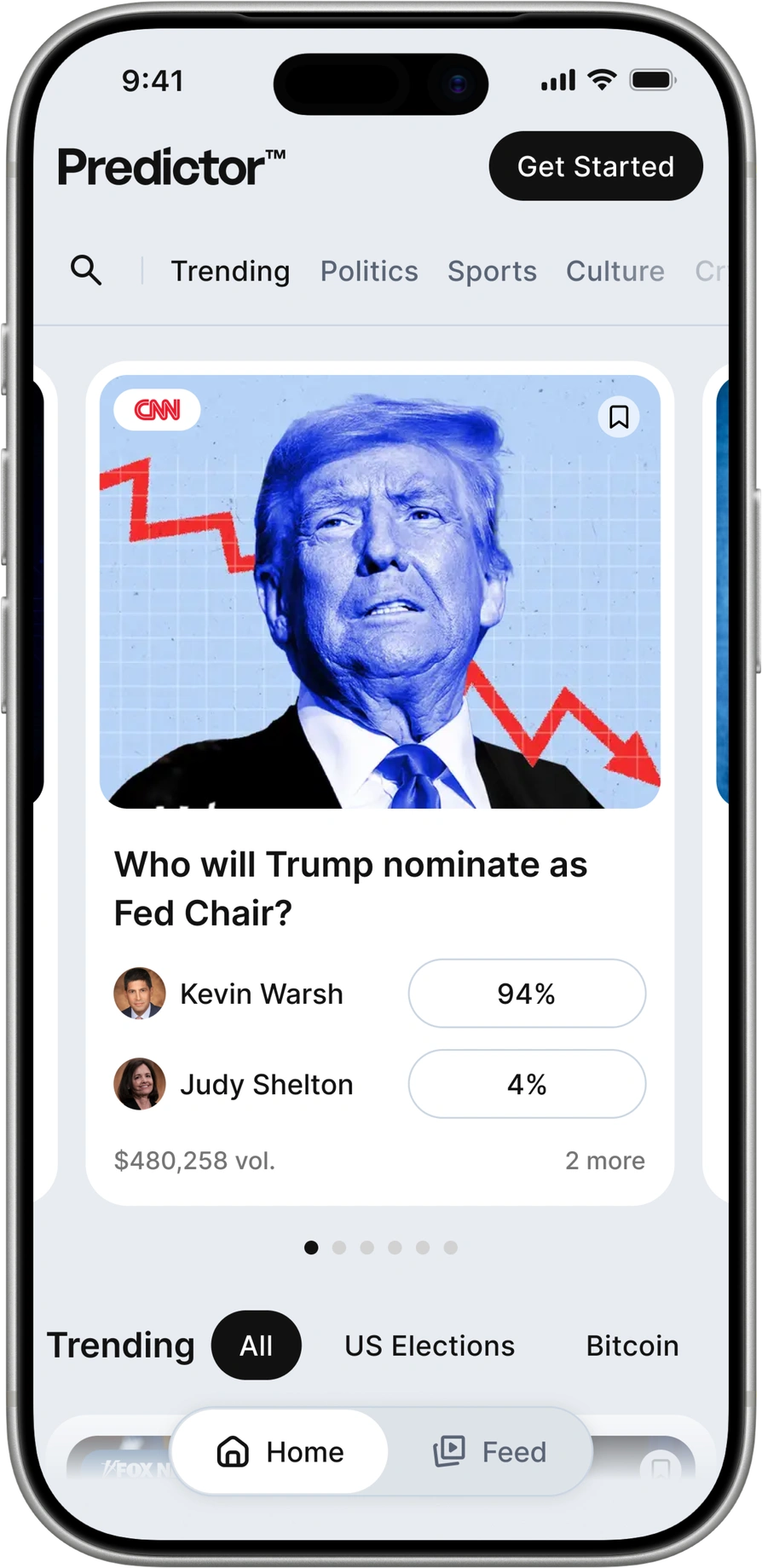
Home was redesigned as the main discovery point for markets, news, media, and recently viewed content, bringing key discovery flows together and reducing the need to move between separate sections.
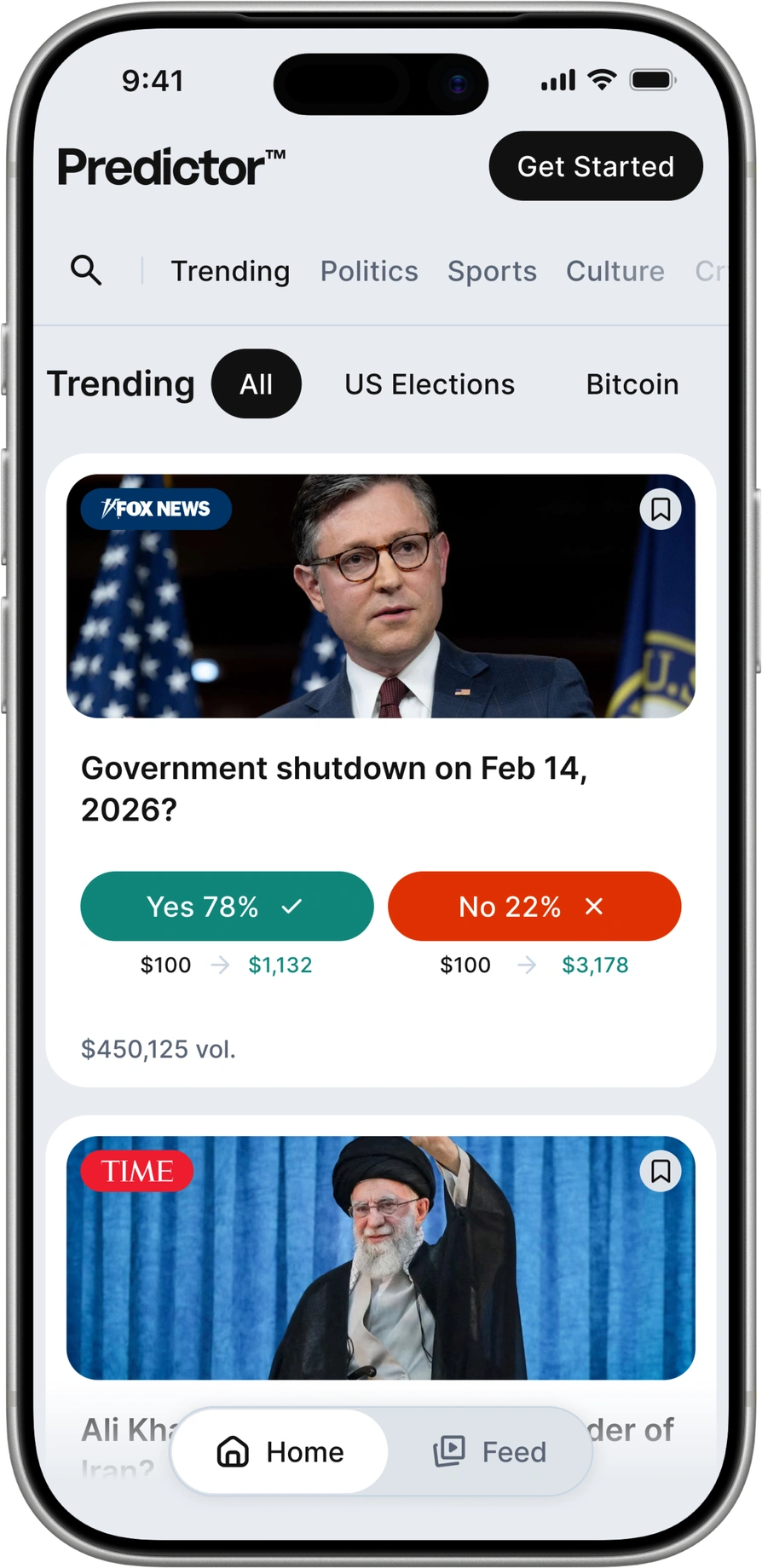
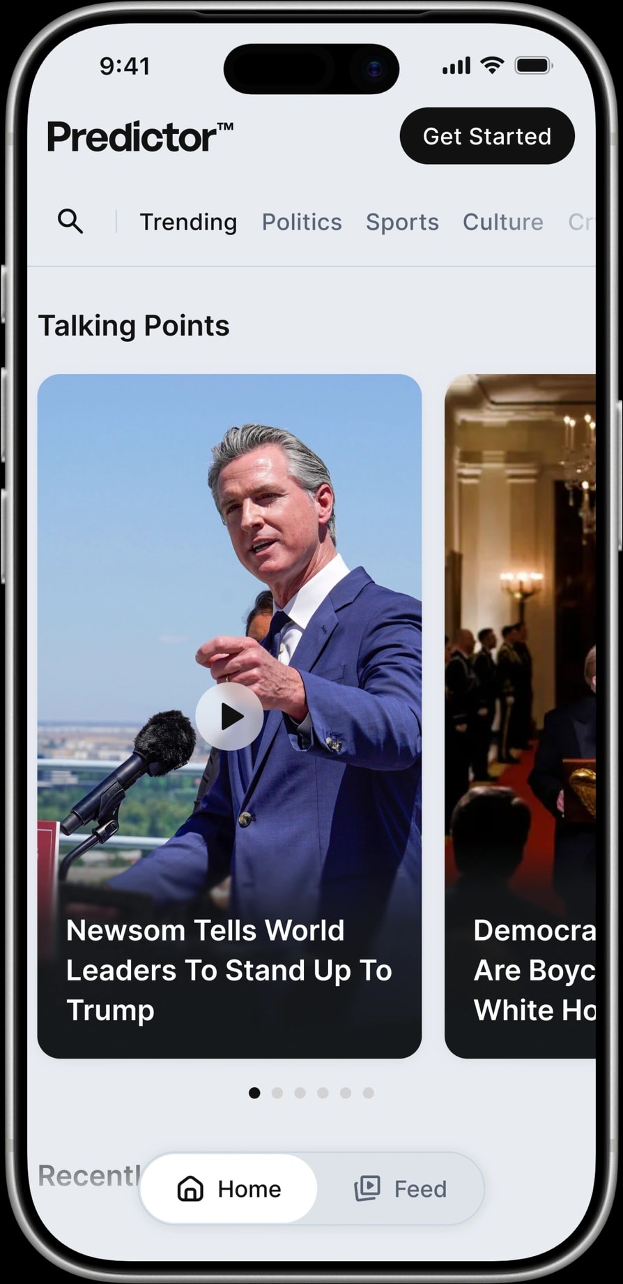
Feed
Predictor is built around real-time events, so quick access to news is essential. The Feed brings this content into a familiar short-form format inspired by TikTok, making current stories easier to browse and engage with.
The main challenge was fitting vertical video into a space-limited layout.
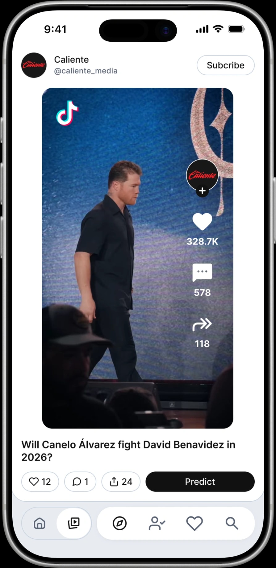
Media widget
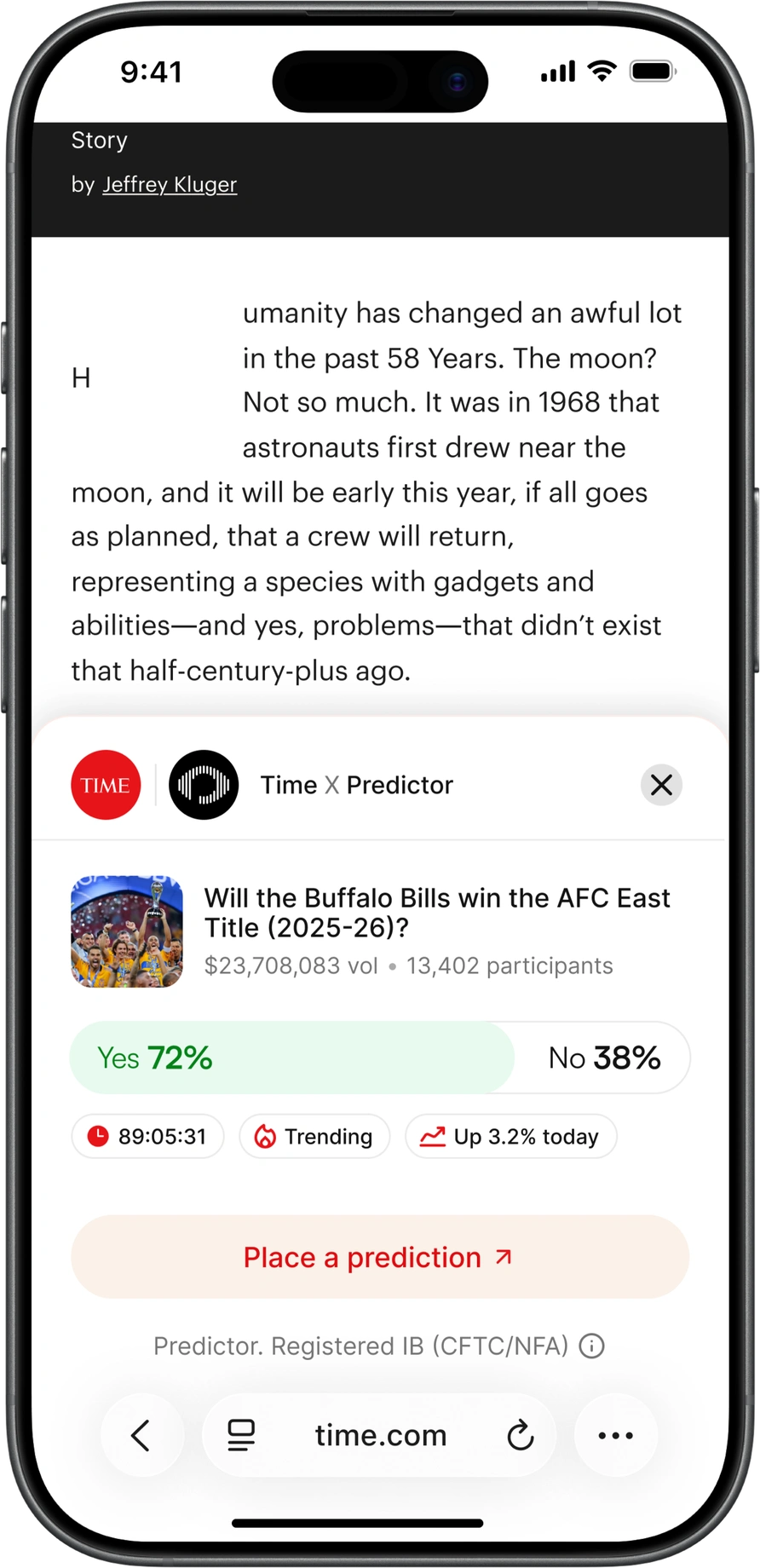
A separate part of the project focused on an embeddable Predictor widget for partner media sites. The widget connects an article to a relevant prediction market and lets readers interact with it directly from the publisher’s page without interrupting the reading experience.
Because the partner publishers are well-known and limited in number, a single Predictor-styled widget could easily feel like an ad and be ignored. Instead, each version adapts to the publisher’s design system, making the experience feel more native and trustworthy.
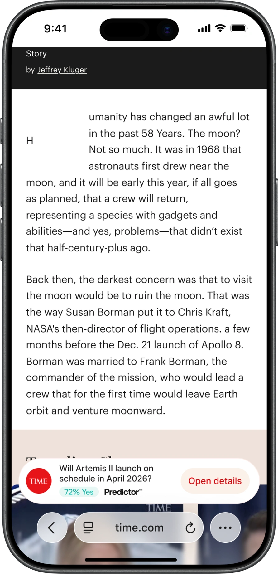
Wallet
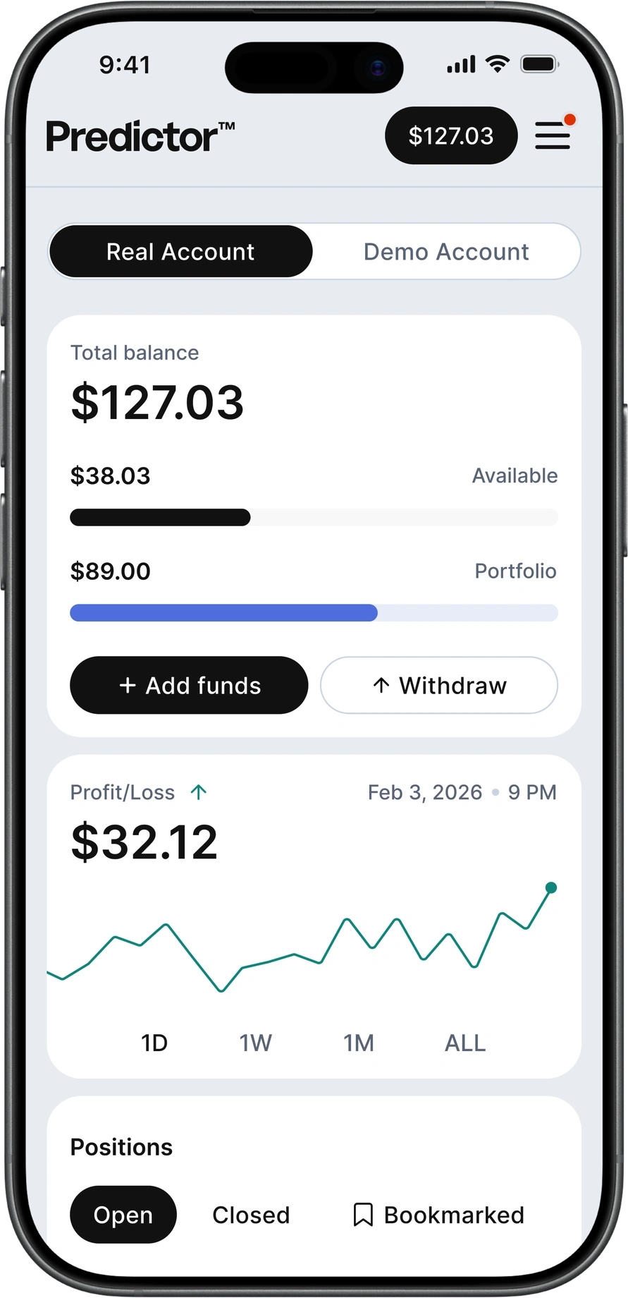
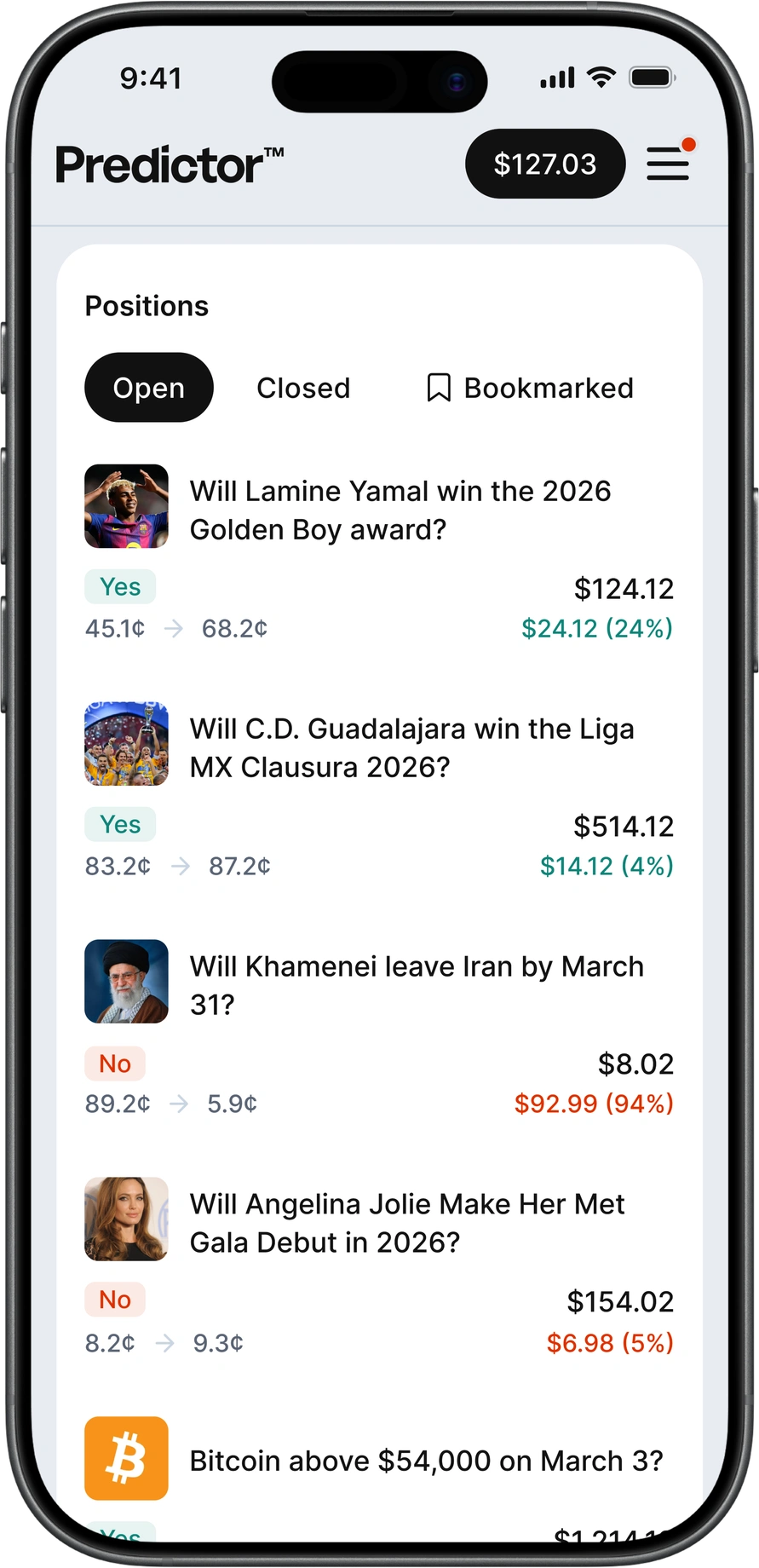
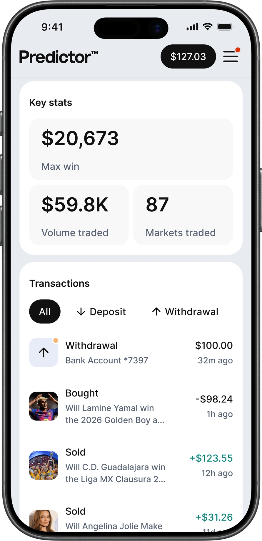
Wallet was reorganized around the information users check most often. Current balance, profit and loss, and open positions were brought higher in the hierarchy to make financial status easier to scan.